Nork Minimalist Wall Clock
Nork Minimalist Wall Clock
A pared back dial with bold hands on a quiet quartz movement, in five colours.
Couldn't load pickup availability
Secure checkout. Payment is encrypted and processed by Shopify.
Shipping cost and delivery estimate are shown at checkout before you pay.

Details and materials
Details and materials
The Nork is a wall clock designed around one requirement that most decorative clocks quietly fail: you should be able to read it from across the room without stopping to work it out. That comes down to contrast and hand length far more than to sheer diameter, which is why a large clock with thin, pale hands is often harder to read than a smaller one with bold, well-proportioned ones. The Nork dial is built the sensible way round. The face is kept plain, the markers are pared back to what you actually need, and the hands are given weight and length so they register at a glance rather than on inspection. The result is a clock that works as a piece of quiet decoration on a wall and still does the job it exists for. The styling is minimalist in the genuine sense rather than the fashionable one: there is no ornament competing with the time, no oversized branding across the face, and no decorative flourish that makes the hour ambiguous. That restraint is what lets it sit comfortably in very different rooms, from a pale Scandinavian-leaning interior to a warmer, more traditional one, without looking like it was chosen for a different house. A clock is a functional object hung at eye level, and the ones that last are the ones that stay legible after the styling stops being novel.
Five colourways are offered, in grey, blue, orange, green and white, which is a broader spread than most minimalist clocks bother with, and it changes how you can use the piece. White and grey are the neutral options, and they disappear into a wall in the way a utility object often should, reading as part of the room rather than as a feature. Blue and green are quieter colours that still register, and they work well where a wall is otherwise bare and you want something to break it up without hanging art. Orange is the one deliberate accent in the range, and it behaves like a small piece of colour blocking: against a white or a deep neutral wall it becomes a focal point on its own. Worth thinking about is what surrounds the clock rather than the room as a whole, since a clock competes with whatever hangs nearest to it. Above a doorway or on an otherwise empty wall a stronger colour earns its place; on a busy gallery wall the neutral finishes are the better decision. The movement is a quiet quartz mechanism, which matters most in bedrooms and home offices where a loud second-hand tick that goes unnoticed during the day becomes impossible to ignore at eleven at night.
Placement is where most clocks are let down, and the conventional advice to hang one slightly above eye level rests on something practical rather than aesthetic. You glance at a clock while doing something else, usually while walking through a room or working at a desk, and a clock hung low ends up behind furniture or blocked by whoever happens to be standing in front of it. Above a doorway, on the wall a desk faces, or on the kitchen wall facing the work area are all positions where it simply does its job without being thought about. Power is a single AA battery. One piece of knowledge worth having: if a quartz clock starts losing a few minutes a week, that is almost always a tired cell rather than a failing movement, and a fresh alkaline resolves it and will usually run for the better part of a year before it needs attention again. Hang it on a dry indoor wall and keep it out of the direct steam path of a kettle or a shower room, which is a placement question rather than a fault in the clock. Beyond that it asks for nothing but an occasional dust. It is a plain, well-proportioned clock that looks considered rather than bought in a hurry, which for most walls in most homes is the entire requirement.
- Design: Minimalist round dial, high-contrast hands
- Colours: Grey, Blue, Orange, Green or White
- Movement: Quiet quartz sweep
- Power: 1 x AA battery
- Display: Clean pared-back dial, legible at distance
- Placement: Dry indoor walls; avoid direct steam
- Care: Dust with a dry cloth
Shipping and returns
Shipping and returns
Shipping options, cost and delivery estimates are calculated at checkout once you enter your address. Our full shipping and return terms are published in the store policies linked in the footer.


Legible Is The Whole Design
Reading a clock at distance depends on contrast and hand length far more than on diameter, which is why a big clock with thin pale hands beats a smaller one with bold ones rather less often than you would think. The Nork gives weight to the hands and keeps the face plain.

Minimalist In The Real Sense
No ornament competing with the time, no oversized branding, no flourish that makes the hour ambiguous. That restraint is what lets it hang in a pale Scandinavian room and a warmer traditional one without looking like it was chosen for a different house.

Colour As A Decision
White and grey disappear into a wall the way a utility object often should. Blue and green break up a bare wall without hanging art. Orange behaves like colour blocking and becomes a focal point on its own against white or a deep neutral.
Minimalist in the real sense.
More from Azzalini
-
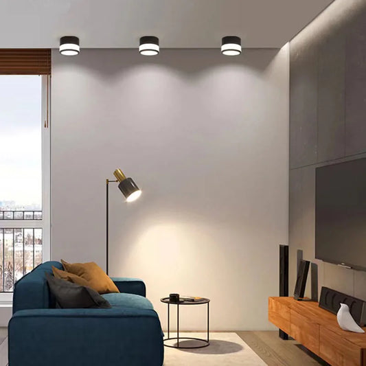
Nordic Surface Mounted LED Downlight
Regular price From $49.99 USDRegular price -
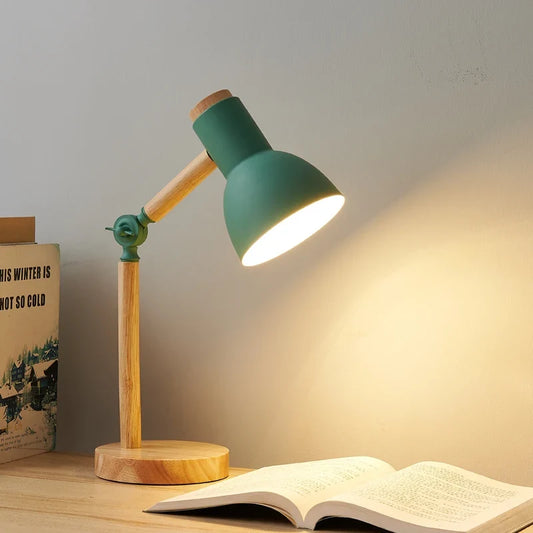
Nordic Wooden Desk Lamp
Regular price $114.95 USDRegular price -
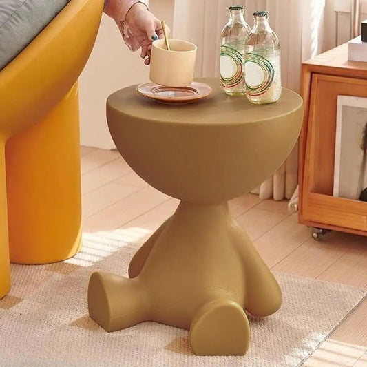
Cartoon Bear Side Table
Regular price $149.99 USDRegular price -
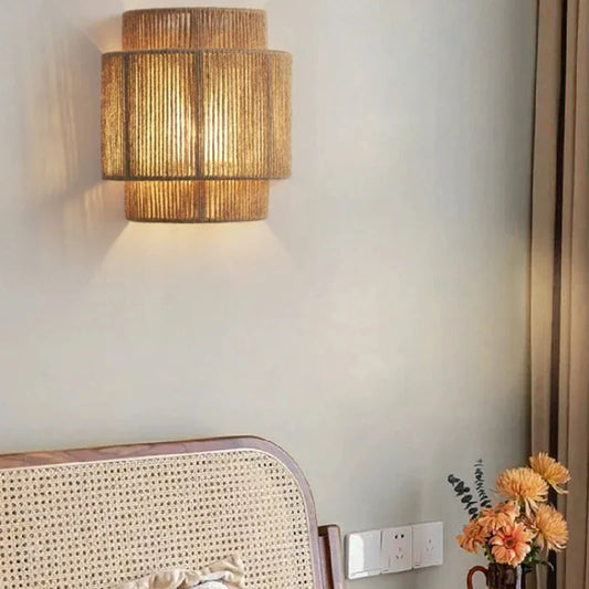
RattanGlow Woven Wall Lamp
Regular price $134.95 USDRegular price$170.00 USDSale price $134.95 USDSale